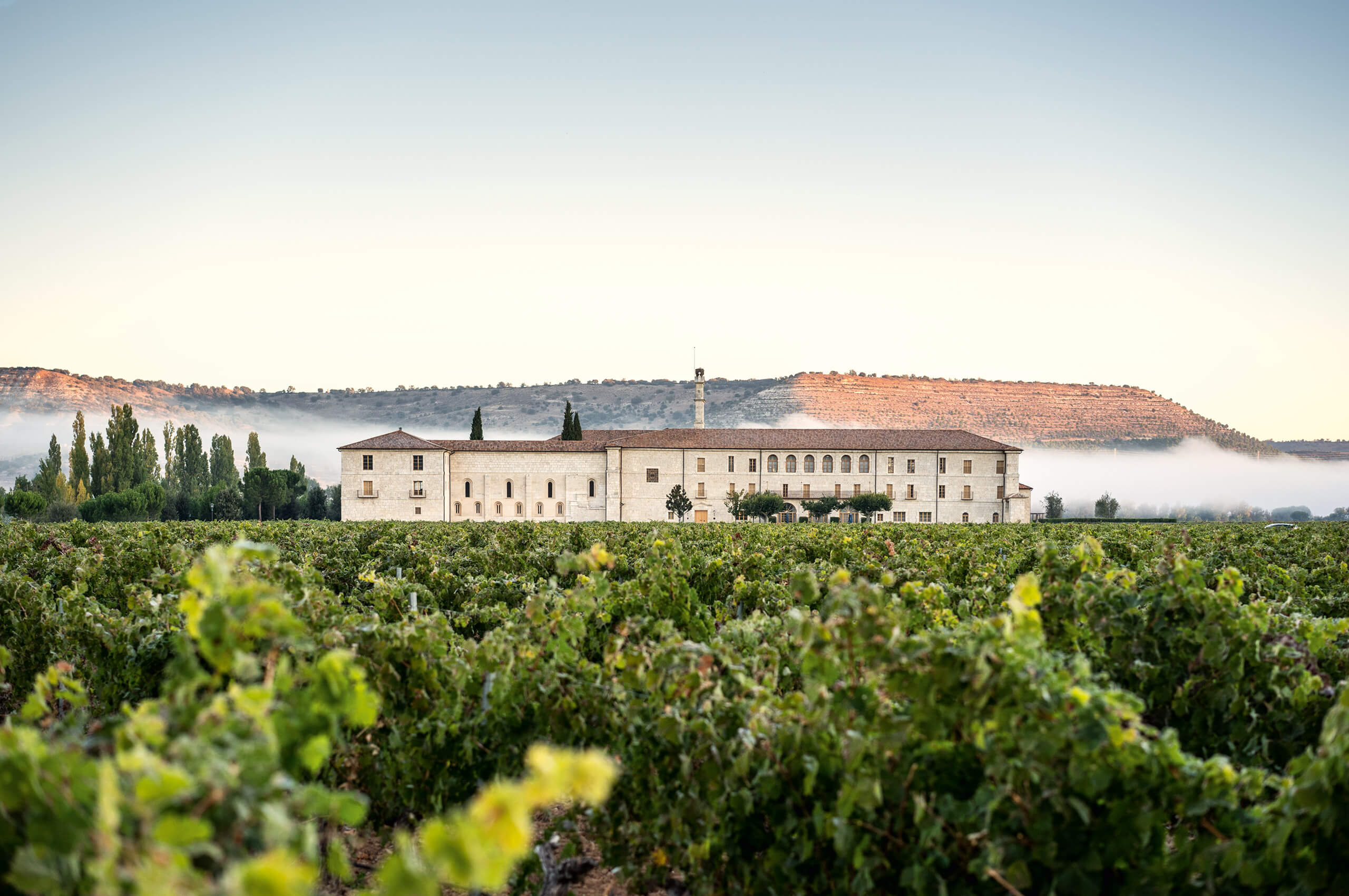
We had found the abbey in poor condition. Parts of the old cloister were badly damaged. Windows were missing, rain had poured in, we could see through collapsed ceilings from one floor to another, and even the historic walls had makeshift additions attached to them. The amazing thing, however, was that even in this pitiful state, the soul of the abbey had remained intact. This testifies to an impressive structural integrity that can be traced back to the original vision of the monks. They had built the abbey knowing that it would outlast them for a long time. Thinking about the legacy they would leave for future generations, they chose a building plan that was built to last. Despite centuries of neglect, the structure was still intact, as was the spirit of the abbey.
Our mission was to integrate into the Abbey the necessary spaces and other functions needed for the new and growing wine business – workstations, offices, meeting rooms, a dining room for employees and the wine shop.
It was clear from the beginning that we wanted to honor and preserve the authentic character of the abbey when restoring the building. To impose a new architectural signature on such a historic building would only detract from the original vision. We devoted ourselves to the task of finding solutions within the existing conceptual framework – and always asked ourselves first how the monks would have approached each problem. Whenever possible, authentic materials, colors and techniques were used. Quantitative interventions were made to bring the interiors up to contemporary standards, but these interventions were made invisible to the viewer.
Interventions in an existing building have a scale that is missing in a new building, namely the original. Solutions for this unique object could not be designed at a desk, because each room of the abbey was individually designed by the monks. For example, each window was unique. The extraordinary characteristics of irregularity and imprecision, which constitute the individualism of the abbey, subsequently ran through all the restoration work. We had to constantly learn new skills, whether it was dealing with the irregular floors or the unusual bronze window frames. Constant questioning brought completely new perspectives and unexpected obstacles regularly demanded inventive solutions. Often, decisions made in the office proved impossible to implement on site, and everything depended on what could be achieved with the local craftsmen. The old building seemed to demand its own solutions, while our skills had been honed to today’s standards. For most of us, this experience represented an extraordinary personal and professional challenge.
Planning and realization: 2006 – 2016, Valladolid, Spain
Architecture: Marco Serra, Basel, collaborator Stefan Fürst
General planning: Burckhardt & Partner AG, Basel
Furnishing: Marlene Doerrie Lampugnani, Milan
Landscape architecture: Kuenzel Landscape Architects, Basel
Lighting: LichtKunstLicht, Bonn
Corporate Identity: Mifflin-Schmid design, Zurich
Spa: Diener & Diener Architects, Basel
